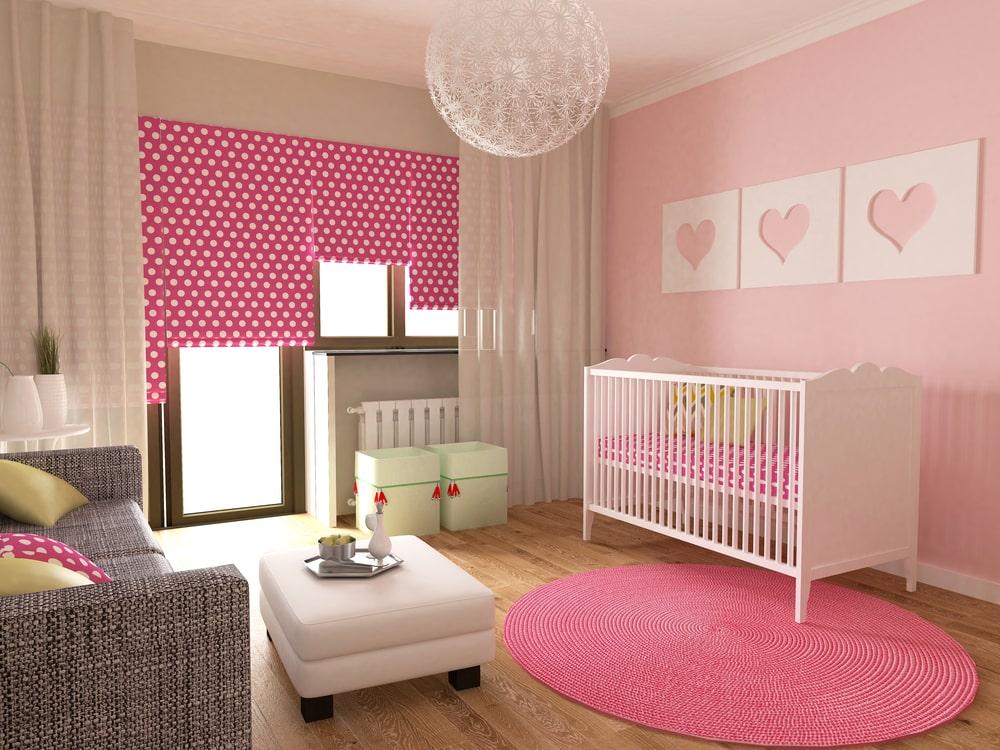
Picking nursery colors for a baby might be challenging. Many families enter the realm of color with nothing more than passion and hope, to avoid the typical pink or blue alternatives. Whether you’re designing a nursery or updating your child’s room, just a little psychological assistance may be beneficial.
Are you aware that adopting particular nursery colors, such as vivid red or yellow, may alter infants’ emotions, sleep habits, and even the amount kids eat, according to color psychologists?
Colors can greatly alter the interior design of a space, and for newborns, you should select a color in the range that is equal parts tranquil, relaxing, and caring.
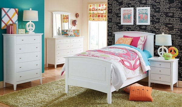
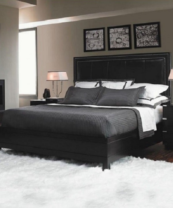
White
White is an excellent neutral baby room color. It is often connected with marriages, but it also represents innocence and simplicity. Most designers and color psychology specialists, nevertheless, would caution parents against going over the top with white. Shades, after all, elicit feelings and stimulate cognitive growth in children’s minds. As a result, don’t go all-white in a kid’s room. Vibrant colors such as red, brown, blue, green, and others can be used to provide a splash of color. White walls are monotonous, so while you don’t want to overstimulate the infant, you don’t want to dull them either.
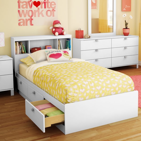
Yellow
Yellow is frequently chosen as a gender-neutral room color, but tread carefully before splattering a sunny hue all over your nursery surfaces. Excessively bright yellow could be unsettling (since yellow is the initial hue the eye can perceive, this is all your infant will notice; that’s a source of disturbance). Soft yellows, on the other hand, can improve focus, memory function, and vitality.
Greens
Color the walls a soothing hue of green to include the environment in your room décor. Green has been approved as a nursery shade because of its relationship with wellness and health, and because it is considered to promote focus and reading skills. For the most relaxing effect, use light to moderate hues, like blue.
Orange –
Warming, Comforting, and Friendly – Orange is an extremely relaxing color. It creates a pleasant atmosphere and encourages interpersonal interaction. Orange is welcoming and makes people feel relaxed. Use a deeper orange for a comfortable ambiance or a vibrant orange for a contemporary punch! You can get inspiration for your kid’s room out of a rhyme or a kid’s book if you wish. Classics like “Twinkle, Twinkle, Little Star” are popular. Consider creating a painting or simply writing on the walls. It might suit the orange walls.
Blue
Toned-down blues, like powder blue, aqua, and mild turquoise tones, are sleep-inducing colors. When we hear of the color blue, we imagine calm oceans and a clear sky, which enable us to soothe both our brains and our muscles.
Soothing blue also can assist to relieve emotions of anxiety or anger, which can help calm your child, whether they’re newborns or toddlers.When you have made a decision you can find house painters in Auckland to get the job perfectly done.
Purple
Purple, the same as blue, may have a highly relaxing and calming influence on your child. Again, softer purples like lavender and lilac will provide a soothing environment for your child while also making the area feel light and spacious. Darker purples should be avoided because they make the space look darker than it truly is. It’s also important to consider that once painted, purples might seem darker on your walls, so choose a lighter shade than your earlier decision.
Conclusion
The psychology of colors studies the little effects that they may have on humans, yet it is only one component of building a loving atmosphere for your kids. You won’t go very far mistaken if you rely on your instincts.
Image by Depositphotos